 Pipsa Martikainen
The problem
Four search patterns and a navigation conflict
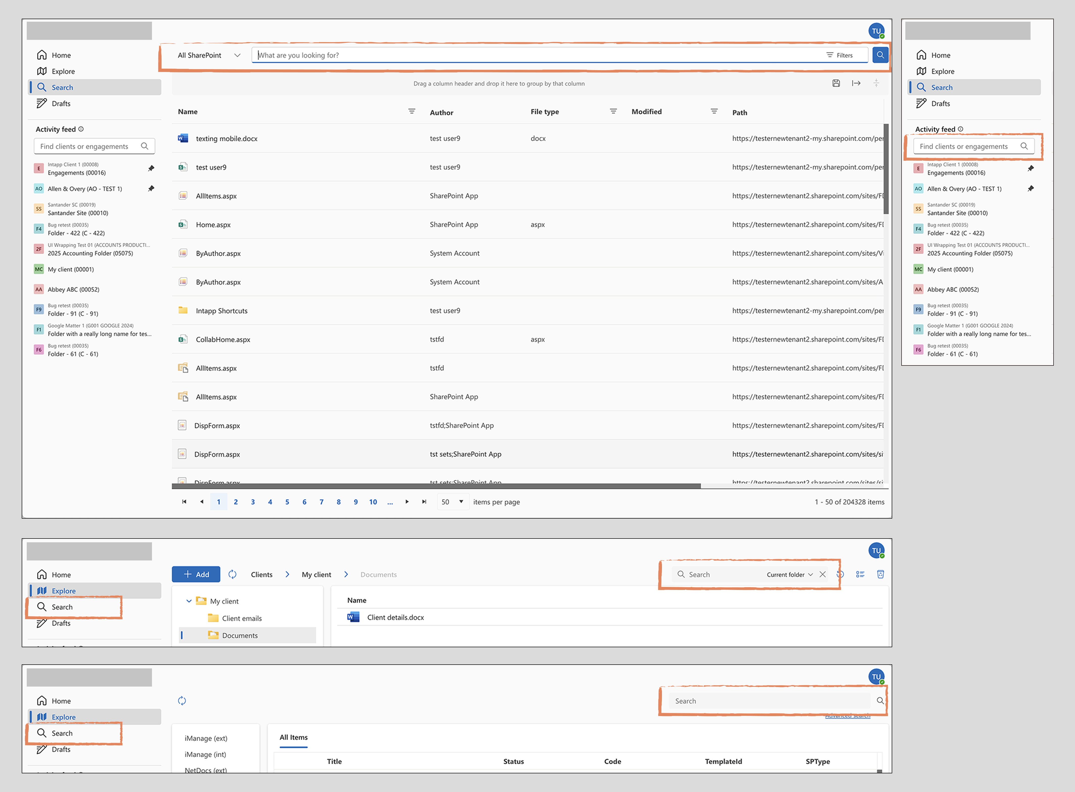
The platform was the result of merging three separate products into one. Each had its own navigation model and search implementation. The unified product inherited all of them, resulting in fragmented navigation, four different search patterns with inconsistent scopes and visual treatments, and no clear hierarchy between them. Users described needing trial and error to understand which search did what and where it would take them.
Navigation was a second, related problem. The existing side navigation consumed significant screen width, which became a real constraint when the product was embedded in Microsoft Outlook and Teams, where available space is already limited. The navigation also visually clashed with the personal app navigation in those contexts.
Both problems needed to be solved in the same initiative.
My role & constraints
Sole designer, no dedicated research phase
I was the sole designer on this project, working with a product director, a product manager, and an engineering lead. There was no dedicated research phase. User feedback had been gathered informally from various sources over time, including input from customer consultants, and this was the primary signal used to frame the problem.
Scope and technical constraints shaped the work throughout. Some directions that were validated through the design process had to be deprioritised at the point of delivery.
Discovery
Framing the problem from accumulated feedback
The problem framing was built from accumulated user feedback rather than a structured research phase. The clearest signals were:
- Users could not reliably predict what a given search would return or where it would look.
- Navigation was competing with content in embedded contexts (Outlook, Teams).
- The visual inconsistency across search instances created cognitive load without any functional benefit.
How Might We questions used to frame the design challenge:
- How might we help users find what they are looking for without needing to know which search to use?
- How might we give users more space for content without removing the navigation they rely on?
- How might we create a search experience that scales as the product grows?
The design challenge
Consolidating without breaking what worked
The core tension was between two product realities: the need to consolidate fragmented patterns into a single coherent system, and the constraint of doing this within an existing product that was already in use.
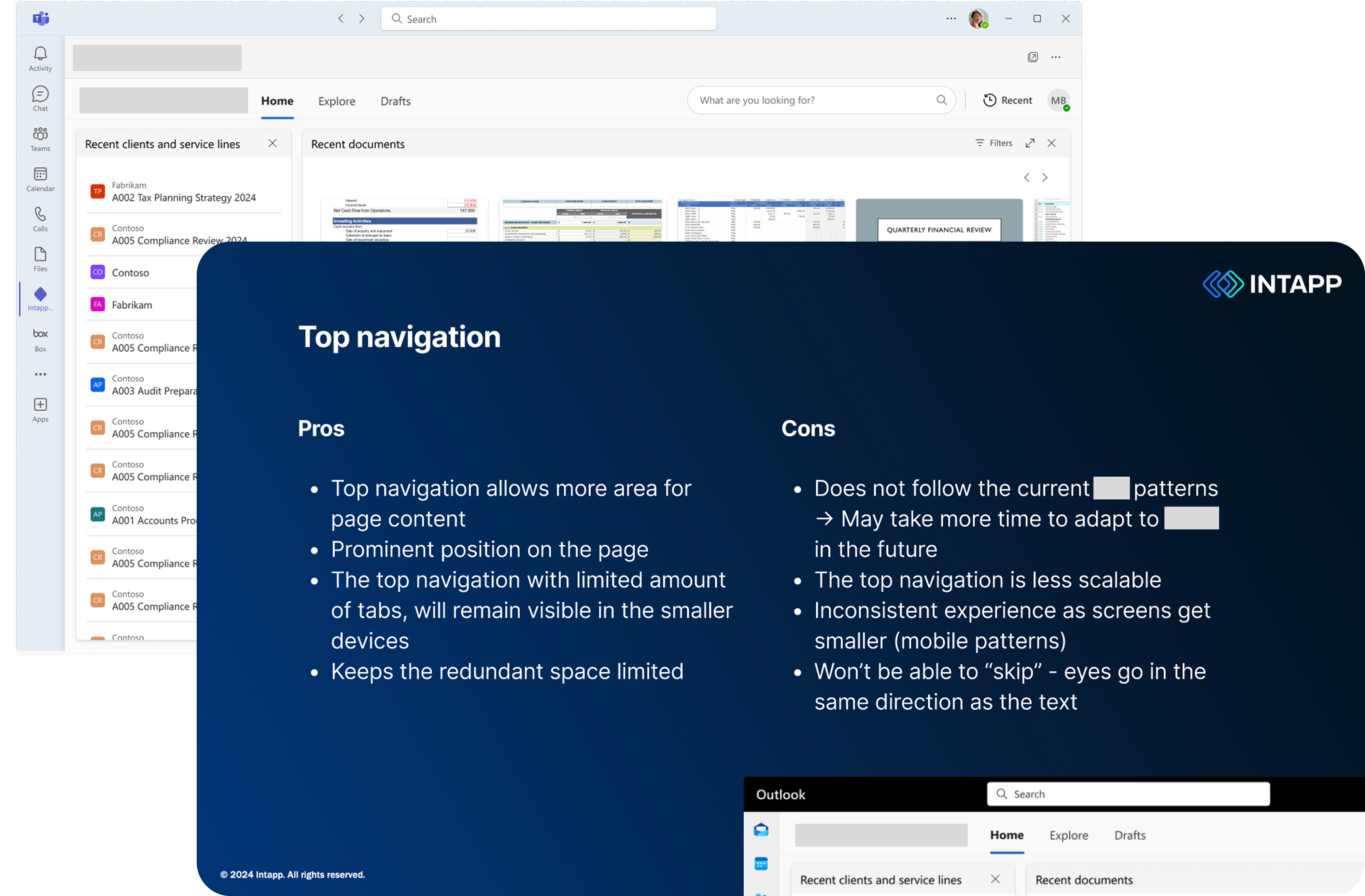
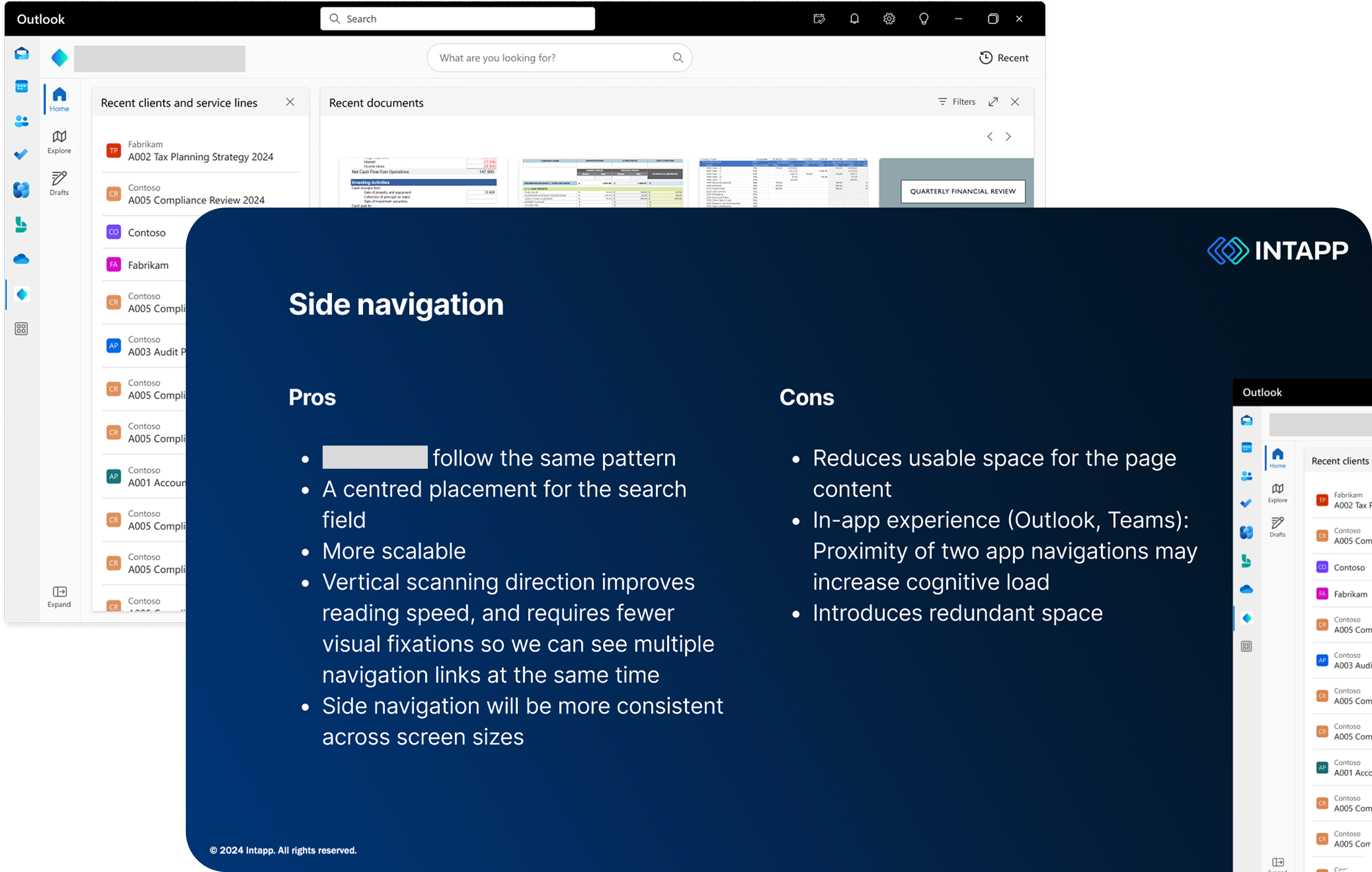
For navigation, the question was whether to move to a top bar or retain side navigation in a refined form. Both had legitimate tradeoffs. Side navigation was more consistent with other products in the suite and technically lower risk. Top navigation solved the space problem in embedded contexts and removed the visual clash with Outlook and Teams personal app navigation, but at the cost of scalability if the navigation grew significantly over time.
For search, the question was how to unify four different patterns without losing the functionality users relied on in each, and how to handle the volume of results that a global search would surface.
Process
From mapping the current state to a unified system
Mapping the current state
The starting point was documenting all existing search instances: where they lived, what they searched, how results were presented, and what actions users could take from them. This made the fragmentation visible and gave the team a shared picture of the problem before any design work started.
Exploring navigation directions
Two navigation directions were developed in parallel to a level of detail sufficient for stakeholder evaluation. Both were presented with explicit tradeoffs rather than a single recommendation, because the deciding factor depended on how the product team and leadership weighted scalability against the embedded use case. This was a deliberate choice to keep the decision transparent rather than design-led.
Designing the unified search system
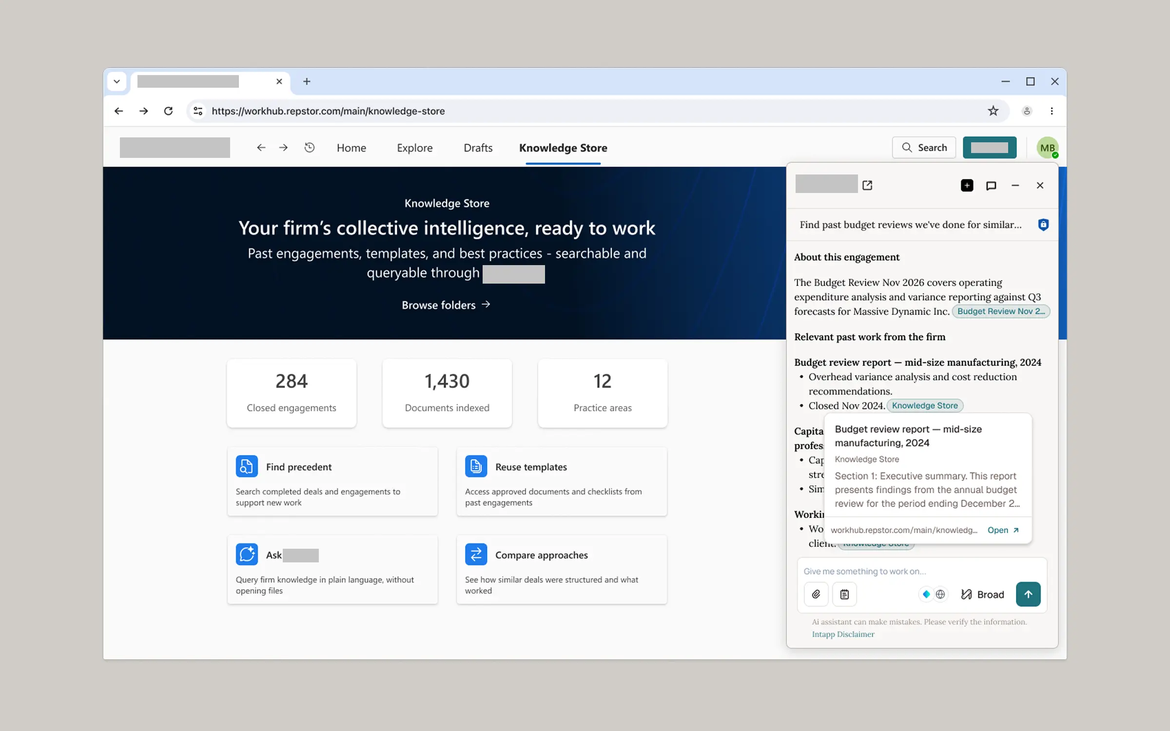
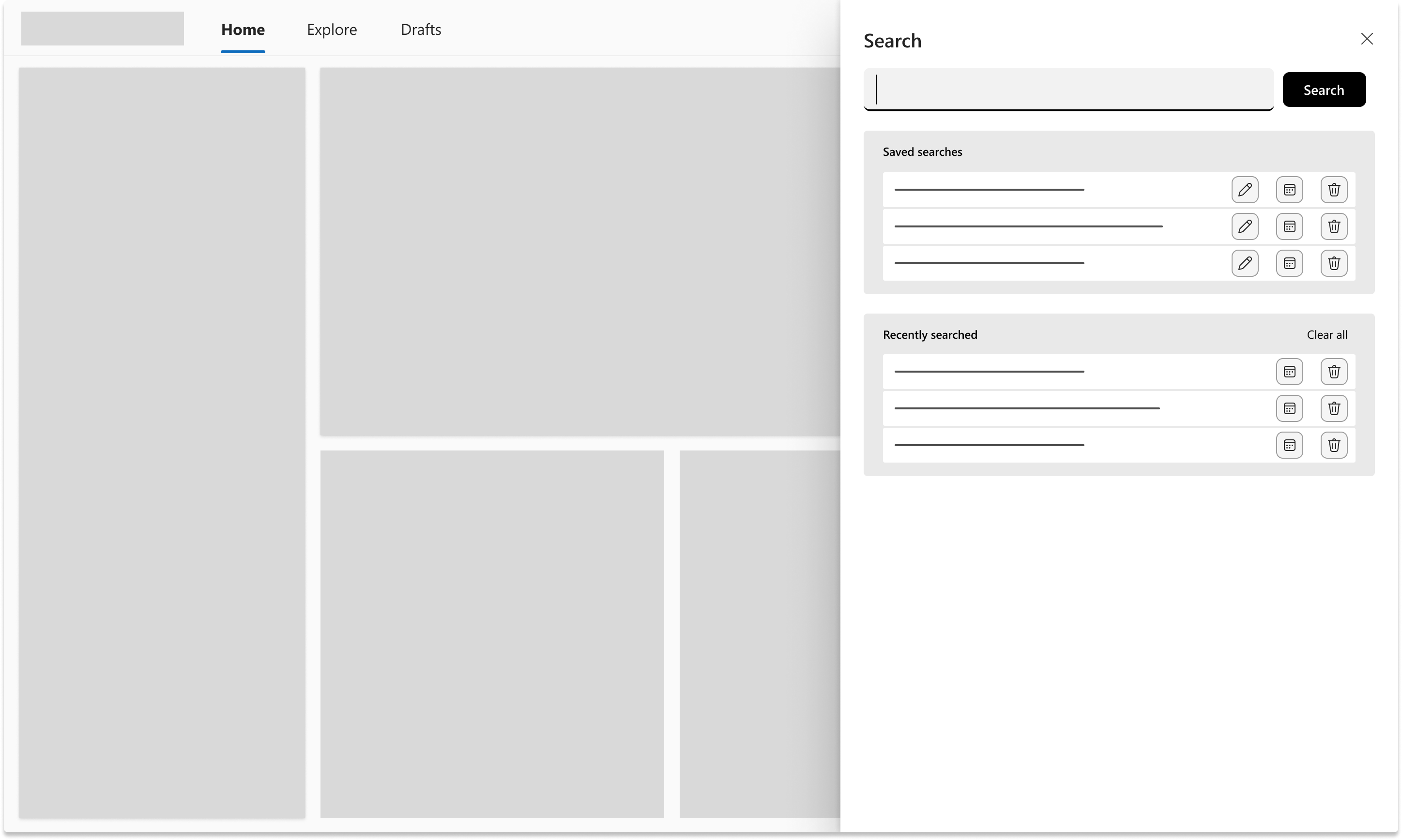
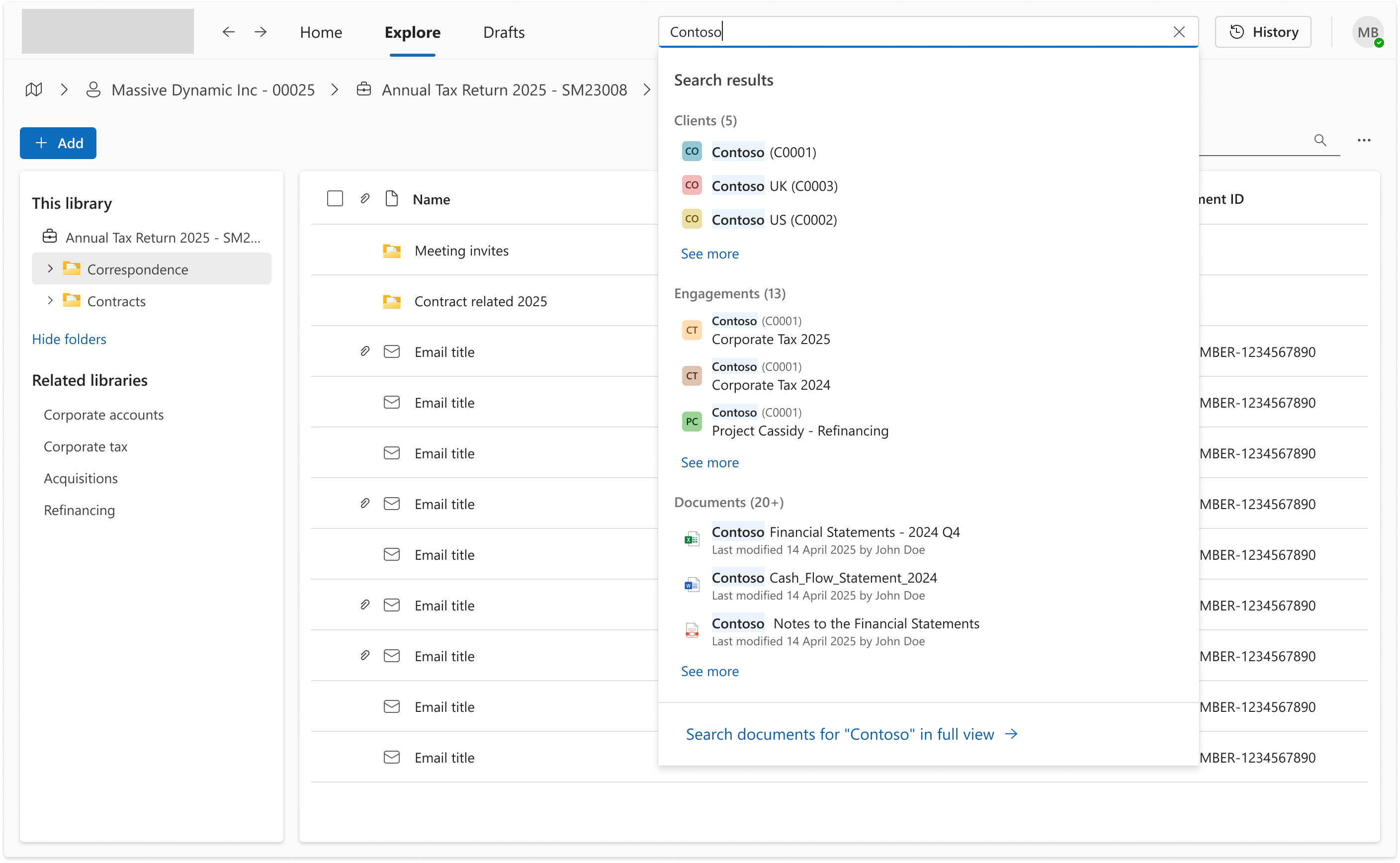
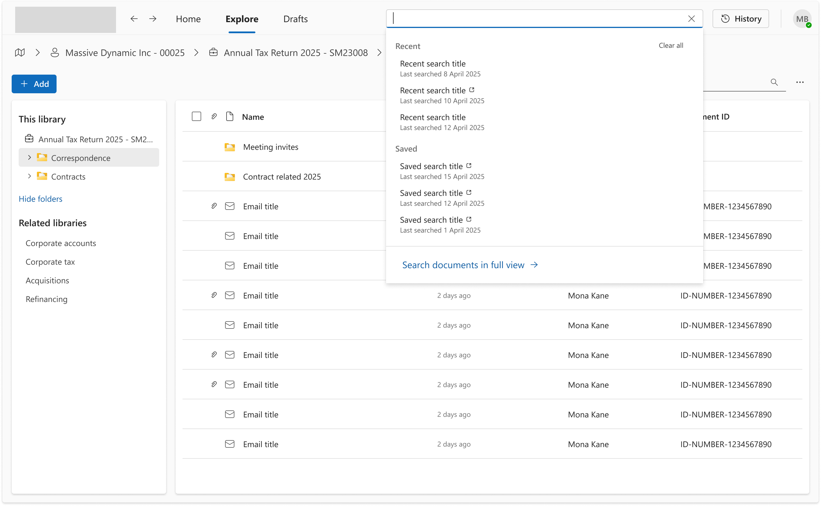
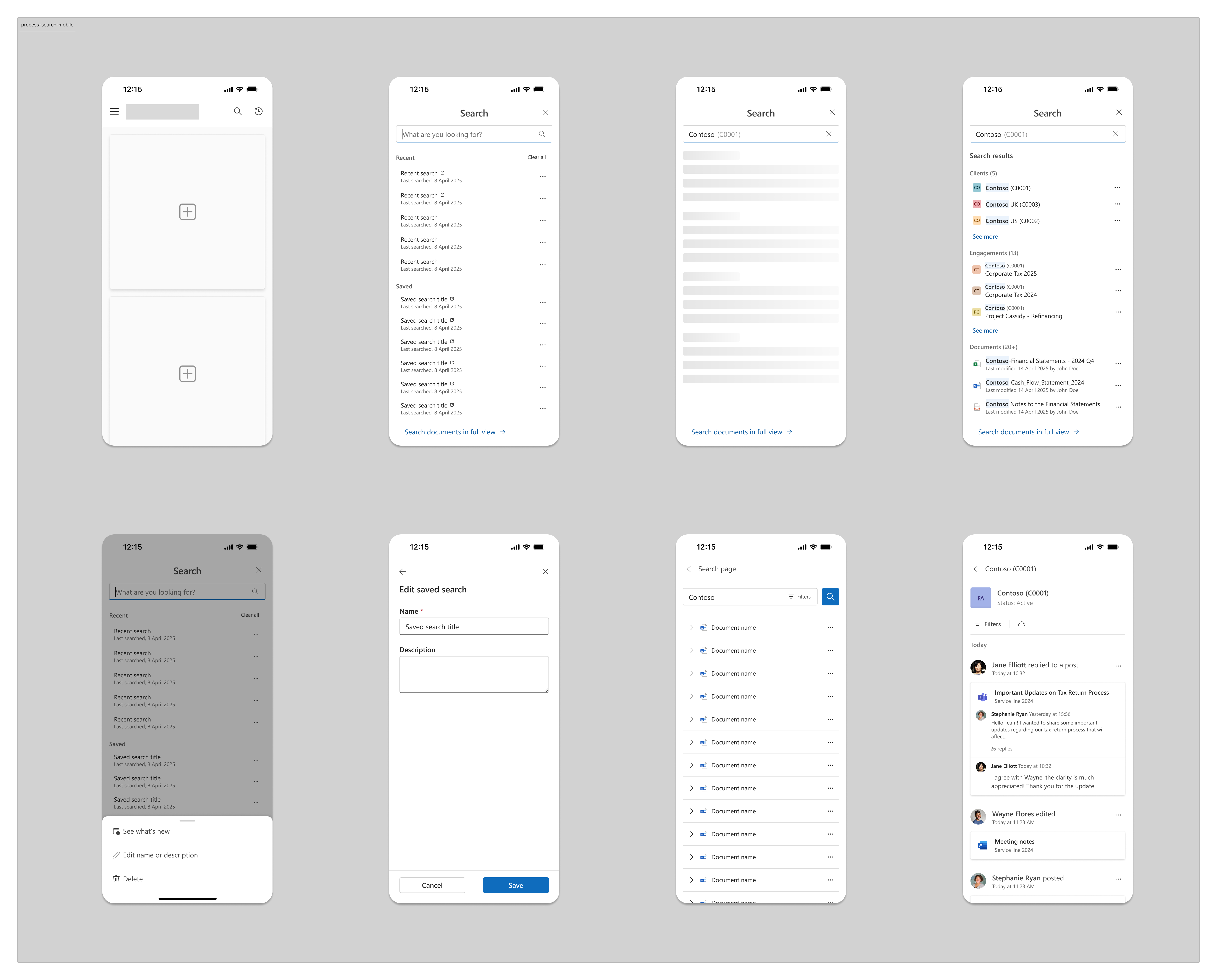
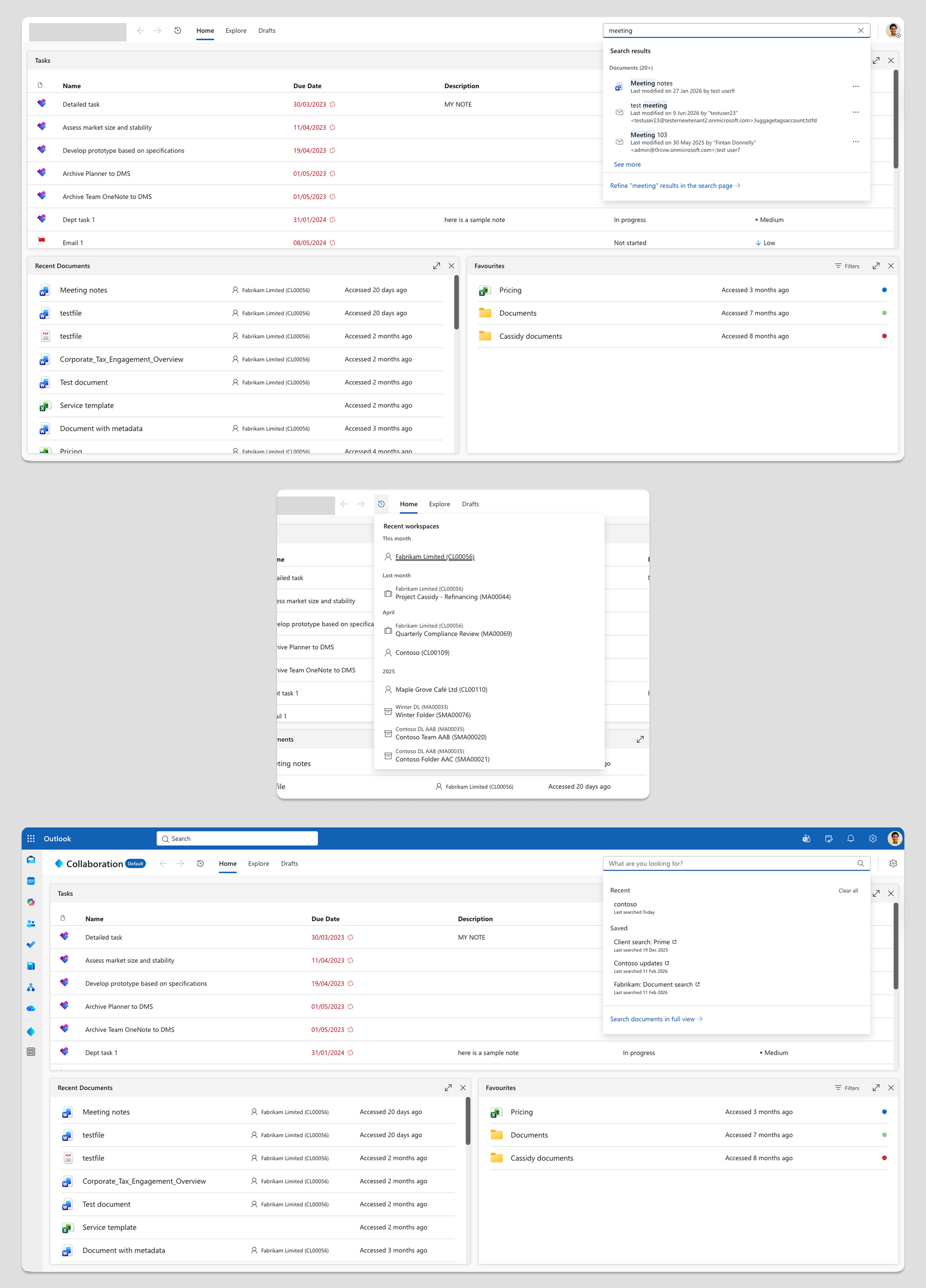
The search solution was designed as a single inline field in the top bar, opening a tray rather than replacing the page. The tray approach was chosen because it keeps users in context while surfacing results, shows categorised quick results across clients, engagements, and documents, and provides a clear escalation path to a full search page for users who need filters and more control. Saved searches with a "See what's new" indicator were included to address the specific workflow of professional services users who regularly monitor the same clients and matters.
The full search system was designed for mobile alongside desktop from the start, ensuring consistent behaviour across contexts.
The first direction explored was a side panel — persistent, anchored to the right edge of the screen. Early wireframes showed it introduced the same space constraints as side navigation, and the panel pattern competes with the host application shell in embedded contexts. The direction was scrapped and replaced with a tray triggered from an inline search field in the top bar.
Iteration during development
One change happened during the build phase in collaboration with the engineering team and product director: the History button was repositioned to sit alongside the back and forward navigation arrows, improving proximity to related controls. This was a small change but improved logical grouping without requiring design rework.
Key design decisions
The decisions that shaped the system
Top navigation over side navigation
The deciding factor was the embedded context. The app lives inside Microsoft Outlook and Teams for a significant portion of its users. In those contexts, side navigation competes with the personal app shell for space and creates visual noise. Top navigation freed the full width for content and removed the clash. The tradeoff on scalability was accepted, with the understanding that navigation items would be managed carefully going forward.
Search tray over full-page search
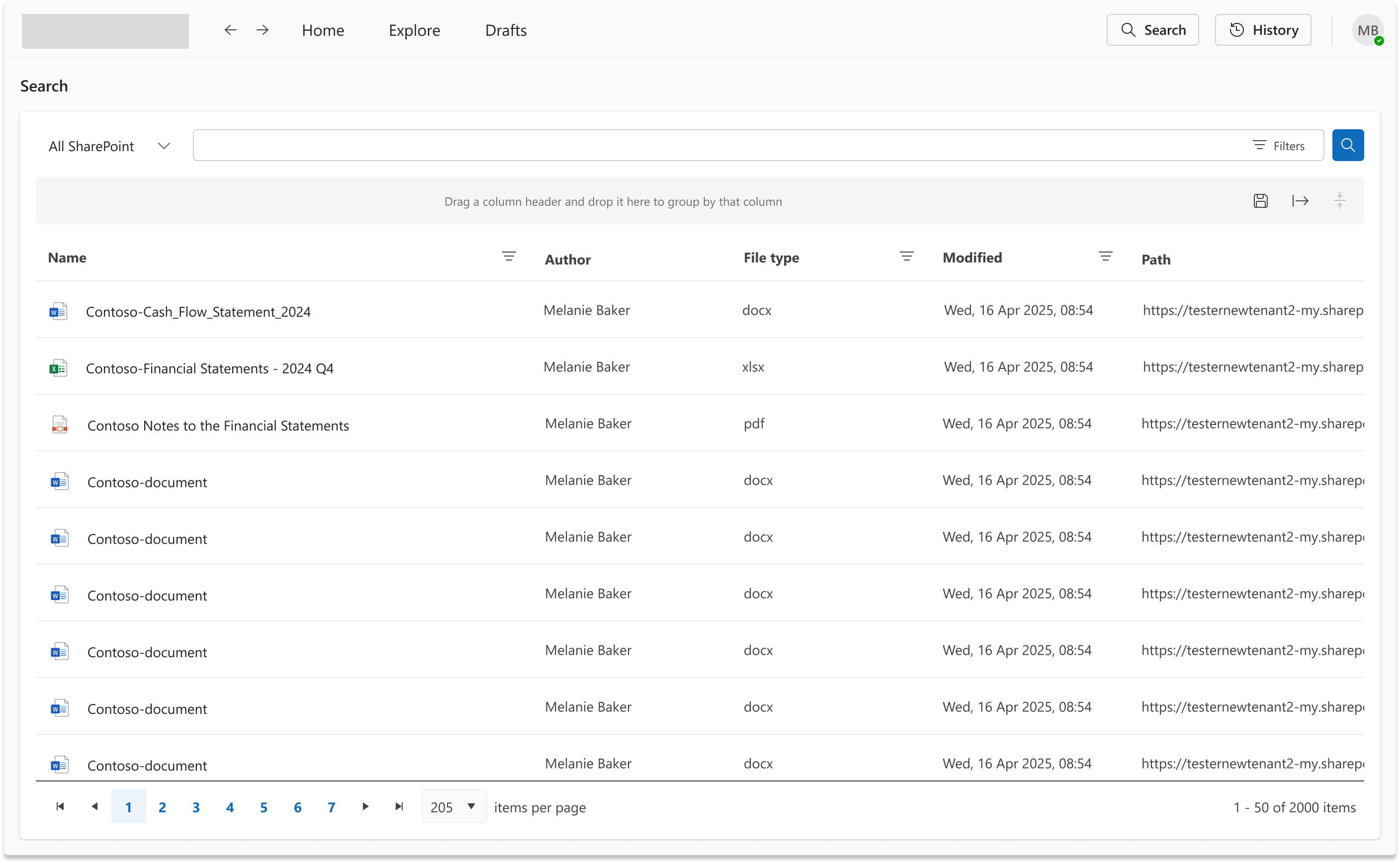
Replacing the page on search would have disrupted the user's context every time they looked something up. A tray keeps the current view intact, allows quick scanning of results, and provides an exit to the full search page when needed. This pattern also supports the workflow of users who search frequently and need to return to where they were.
Saved searches with "See what's new"
Professional services users often track the same clients, matters, and engagements over time. Saved searches with a change indicator directly address this pattern without requiring users to remember what they last saw or run the same search repeatedly.
Unified search as groundwork for natural language queries
At the time, the product did not have an AI assistant. The decision to unify all search into a single system was partly driven by the anticipation that natural language queries would eventually be needed. A fragmented search model would not support that.
The unified search architecture built here later became the foundation for AI-powered search when the AI assistant was integrated into the product.
Artifacts produced
What was delivered
- Navigation exploration: two directions with documented tradeoffs.
- Search tray design: quick results, categorised by type, with escalation to full search.
- Full search page design: structure and layout, scoped for future filter additions.
- Saved searches pattern with "See what's new" indicator.
- Mobile designs for search and navigation.
- Design specifications for handoff to engineering.
Outcomes
A single unified system, shipped
Senior leadership aligned on top navigation. The personal app use case in Outlook and Teams was the deciding factor.
The fragmented search experience — four different patterns with inconsistent scopes and visual treatments — was replaced by a single unified system. The navigation model was simplified to a top bar with three primary destinations, freeing the full screen width for content.
The search tray, full search page, saved searches, and mobile designs all shipped as part of the same release.
To the best of my knowledge, there has been no notable negative feedback about the search since launch. The unified search architecture directly enabled the AI search capability introduced later as part of the AI assistant integration.
What I would do differently
Where the process carried more risk than it should have
No user research was conducted at the start of this project. The problem framing relied on accumulated informal feedback rather than direct observation or structured interviews. That feedback was directionally valid, but it meant design decisions were made without being able to test assumptions about how users actually searched and navigated in practice.
No usability testing was done before launch. The navigation direction was validated through a senior leadership review, which is a form of stakeholder alignment rather than usability evidence. I would push for at least one round of concept testing with real users before committing to a navigation model.
I would also push harder on delivering the full search filters. The filters were designed, received well by the customer consultants team, and were understood to add real value. They were descoped due to technical constraints. In hindsight I would have prioritised keeping them in scope or found a phased delivery path rather than accepting the cut.
Reflection
Foundational architecture has value beyond the release
This project confirmed something I have seen across other initiatives: the absence of structured research at the start does not mean the problem is poorly understood, but it does mean the design has to carry more of the validation work. In this case, the design process compensated by exploring multiple directions transparently and keeping decisions visible to stakeholders. That worked, but it is a riskier path.
The longer-term outcome was not something we could have fully planned for. At the time there was no AI assistant in the product. The decision to unify search was made for immediate usability reasons, but it turned out to be infrastructure for something bigger. That is a good reminder that getting the foundational architecture right has value beyond the immediate release.