The problem
The most requested mobile feature, blocked on the go
Invoice payment was the most requested feature in Accountor Finago's mobile application. Users who needed to review and approve invoices away from their desk were blocked — the desktop product had the capability, the mobile app did not.
The business case didn't need establishing. Stakeholders had already approved development before the design process began. The design challenge wasn't to justify the feature — it was to design a mobile payment flow that matched how financial professionals actually work: processing multiple items, expecting to review before committing, with no tolerance for ambiguity on a financial action.
My role & constraints
Sole designer and Product Owner, in a remote year
I was the sole designer on the development team and also held Product Owner responsibilities for this feature. That meant I was making scope and sequencing decisions alongside design decisions throughout the project. A UX Designer colleague from outside the development team joined as co-facilitator during the prototype testing phase.
The project ran in 2021. COVID-19 had moved the company to remote working. All prototype testing sessions were conducted online — cameras on, screen sharing, participants narrating their interactions aloud. Guerrilla testing ran in-office once restrictions allowed. Tools: Figma, Miro.
Discovery
Framing the problem before touching wireframes
Before touching wireframes, I ran an HMW (How Might We) workshop with the development team and stakeholders. With a feature scoped as broadly as "add payment to mobile", the risk is designing for the first interpretation of the problem rather than the right one. The workshop forced us to articulate what we were actually trying to solve at the experience level, not just the feature level.
The workshop produced four framing questions:
- How might we make the payment process intuitive in a mobile environment?
- How might we show all the needed information before paying an invoice?
- How might we make invoice payment confirmation as easy as possible?
- How might we communicate the right information at every stage of the payment flow?
Following the workshop, I benchmarked financial and B2B mobile applications that already offered invoice or bill payment. The pattern across them was consistent: check invoices, review invoice detail, pay with optional two-factor authentication, confirmation. No significant outliers. That convergence was useful — it defined what users would already expect before they touched the product, and gave the wireframing a structural baseline to build from rather than invent.
The design challenge
Confidence on a small screen, without the friction
The benchmarking established conventions. The workshop established intent. The design challenge was combining them: a payment flow that gave professional users enough information to act with confidence on a small screen, while feeling fast enough to fit into a task list rather than feel like an administrative burden.
The one unknown at this stage was how users actually handled multiple invoices. Single-invoice payment was the assumed primary flow — the model that matched the desktop interaction most closely. That assumption was worth testing before building.
Process
From problem definition to final UI
Phase 1: Problem definition
HMW workshop facilitated in Miro, with the development team and key stakeholders. Output: four experience-level framing questions. I then benchmarked financial and B2B mobile applications, producing a consistent four-step payment model used as the structural baseline for all subsequent wireframing.
Phase 2: Benchmarking and wireframing
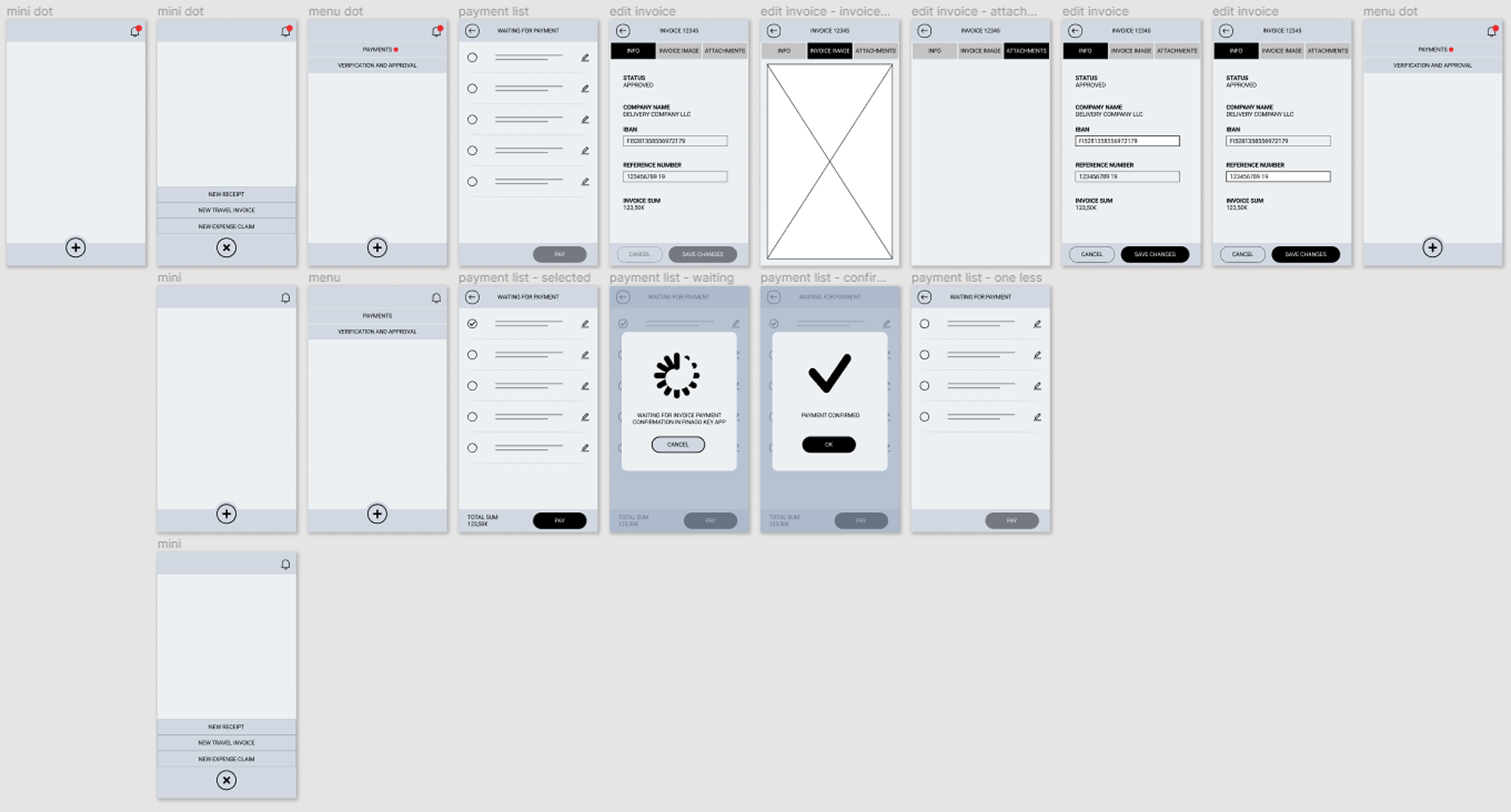
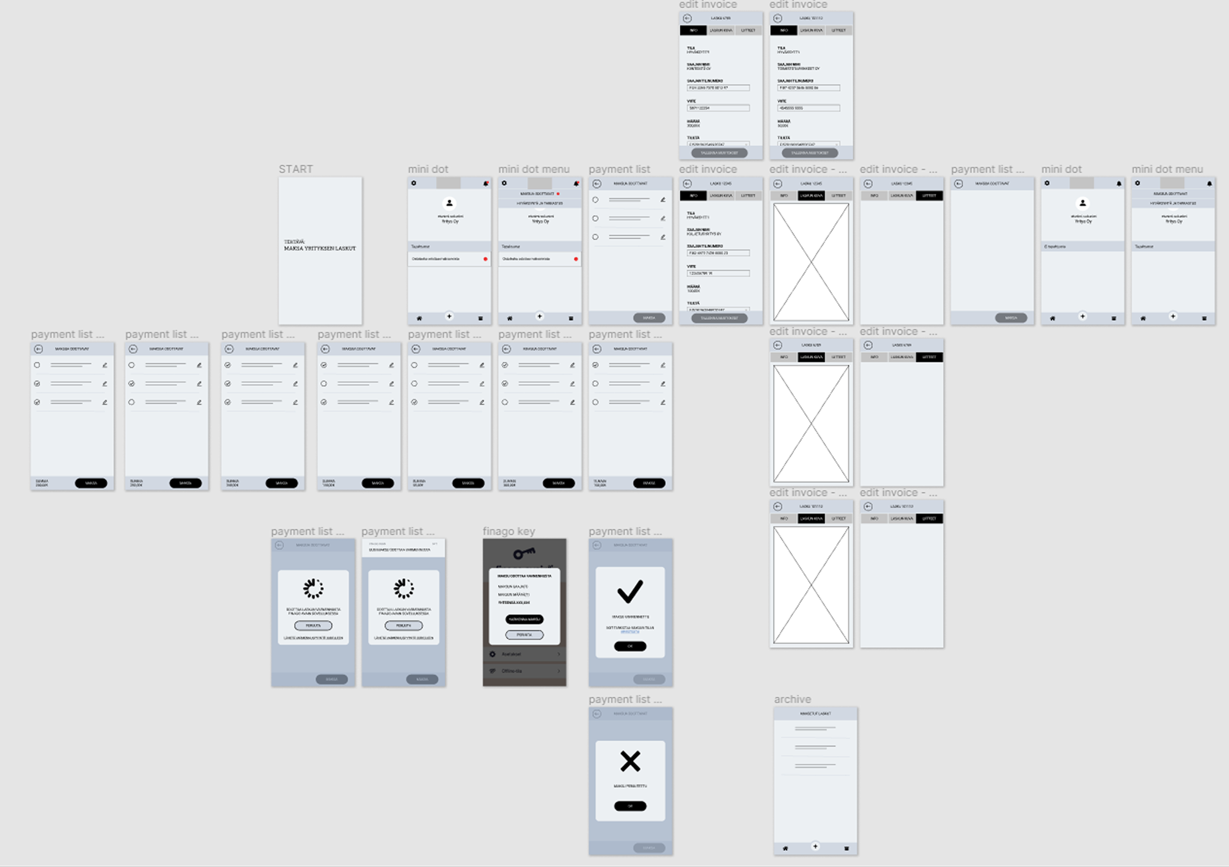
With the HMW output and benchmarking in hand, I started the first wireframe iteration. The initial prototype assumed single-invoice payment — the closest match to the existing desktop workflow and the most common pattern found in benchmarking. I iterated through multiple versions, refining the selection model, the review step, and the confirmation state, before producing the prototype used in testing.
Phase 3: Prototype testing
Five participants. All sessions remote. My UX Designer colleague co-facilitated. Before the sessions, we built an assumptions board — a documented list of every assumption the design was making about user behaviour, needs, and context, each marked as high or low confidence. This meant we were testing specific hypotheses, not just observing usability. Sessions combined a short interview with prototype interaction: participants narrated what they wanted to select and what they expected to happen after each action, with no guidance from me during interaction.
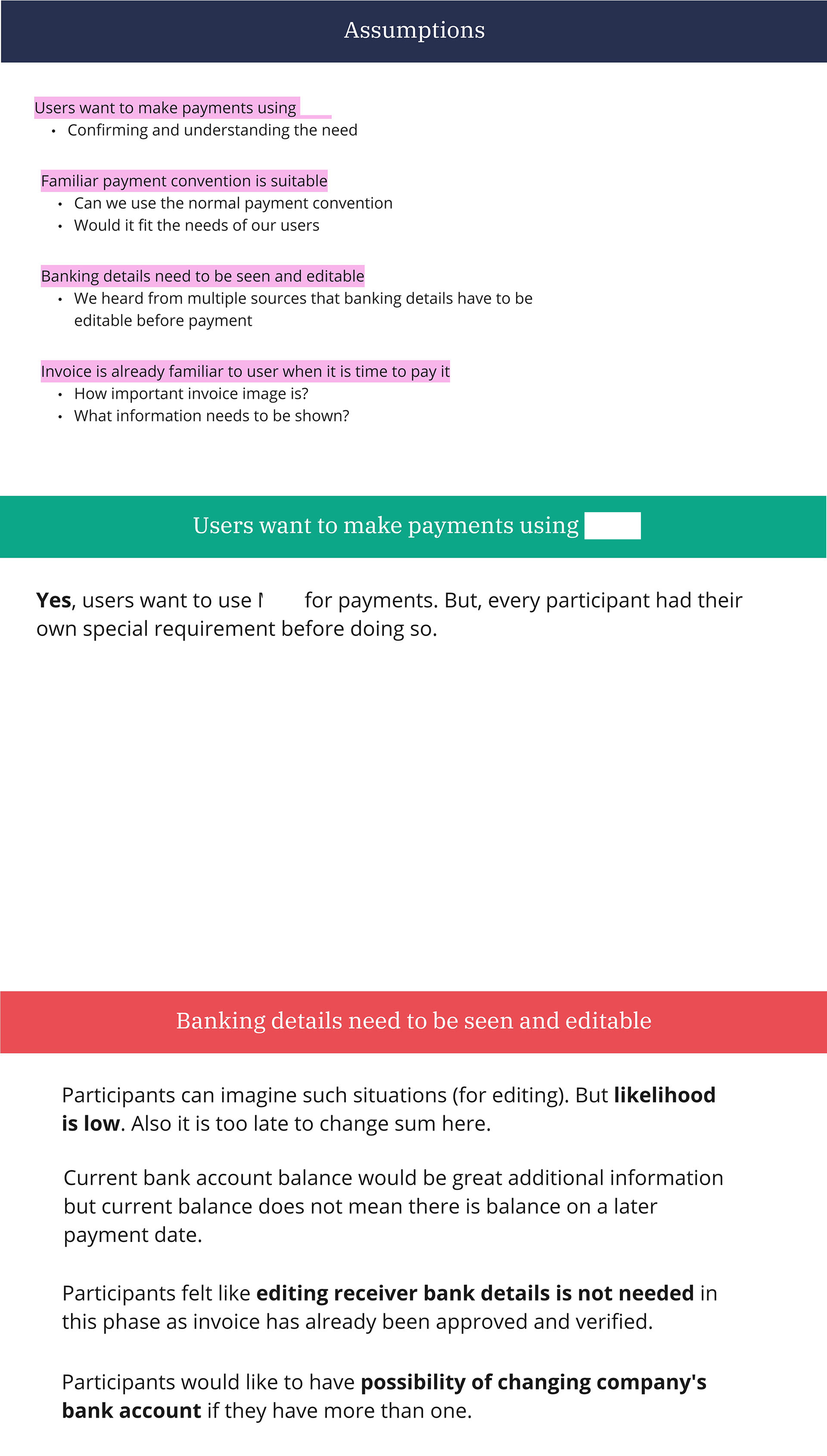
Post-testing, we reviewed each assumption against our notes. Several were confirmed. One critical assumption failed: that users would typically pay invoices one at a time.
Participants expected to select and pay multiple invoices in a single session. For financial administrators processing batches of work, single-at-a-time was friction, not a feature.
After testing, I made the call to add multi-invoice selection to scope. That was a product decision as much as a design decision. Having Product Owner responsibility meant I could act on it without a separate approval cycle.
Phase 4: Guerrilla testing
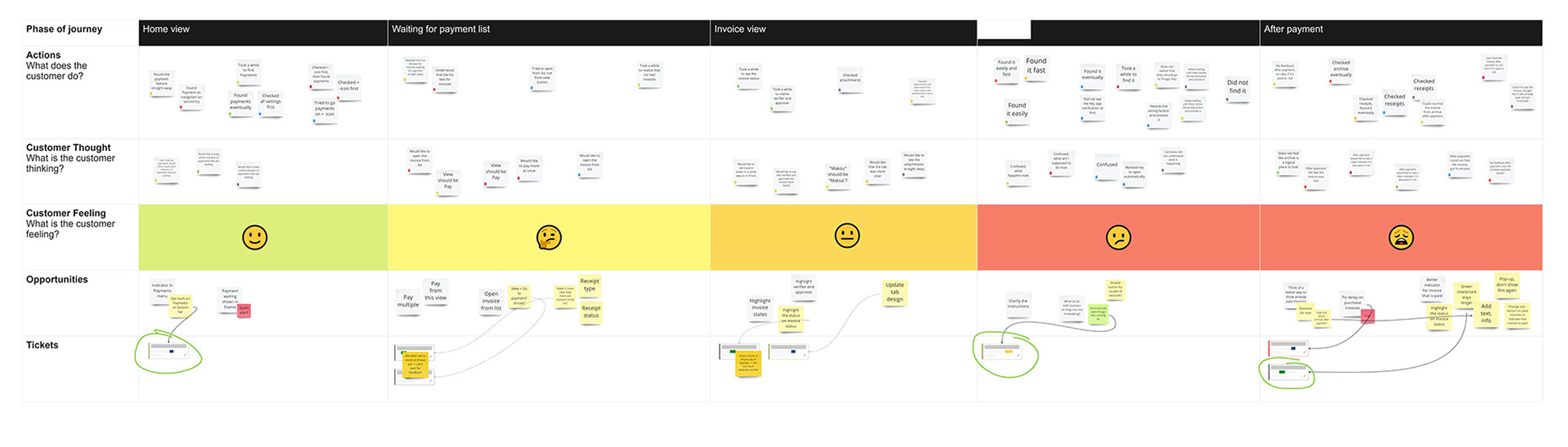
Once the development team had implemented the first version of the feature — including multi-invoice selection — I ran guerrilla testing at the office with eight participants from teams outside the project. Sessions were five minutes each, unscripted. I synthesised the findings using a customer journey map, capturing confidence and friction across the full payment task — from locating unpaid invoices through selection and review to the post-payment confirmation state. It made the findings legible to the development team in a format they could act on directly, rather than a findings report they would need to interpret. The journey map highlighted the later payment steps — review and confirmation — as the most challenging part of the flow, and the team made targeted changes to those stages based on the output.
Phase 5: Final UI
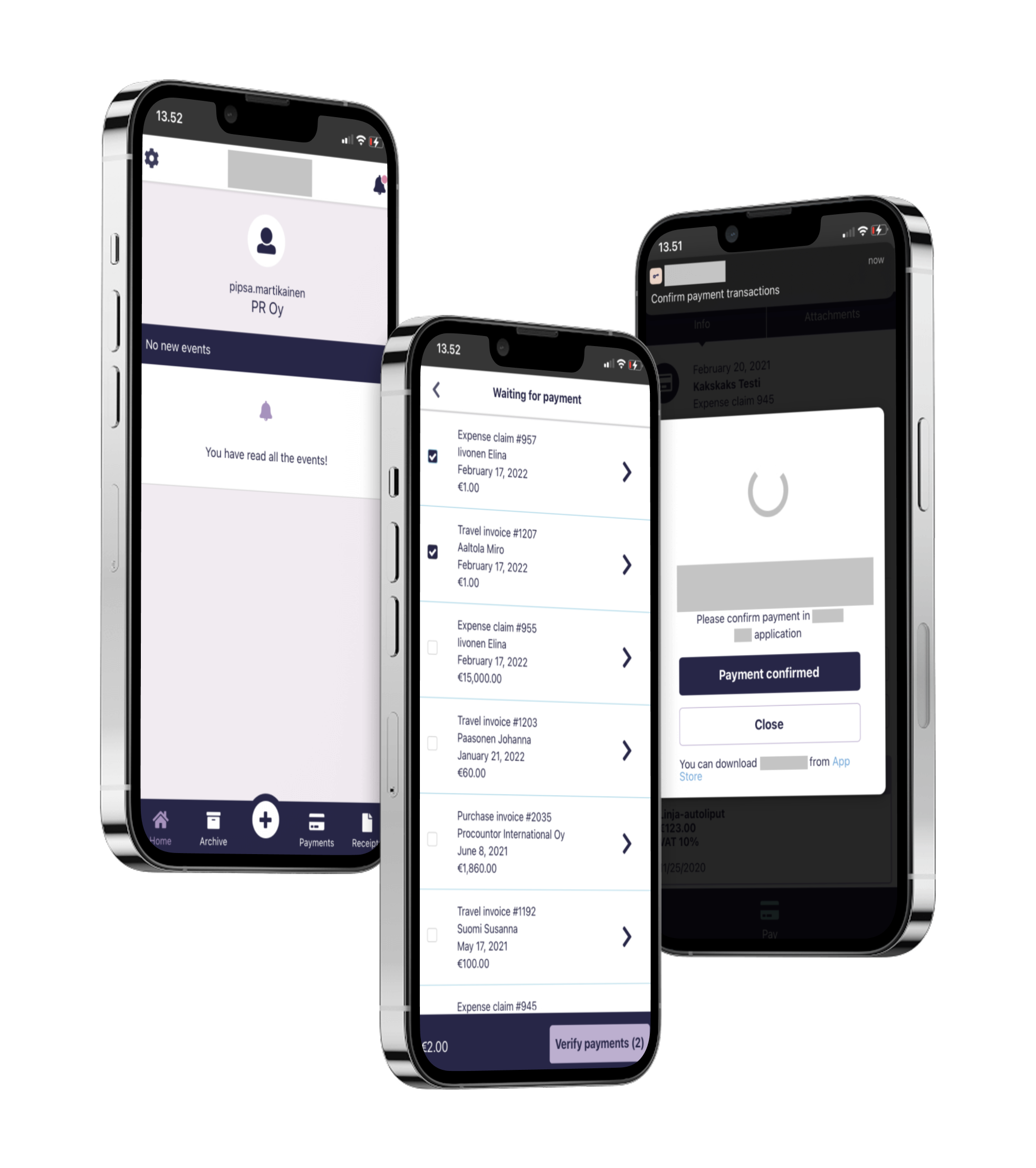
The final UI was produced from the iterated prototype and guerrilla testing findings. It covered four states: invoice list, multi-selection, payment review, and confirmation. The changes informed by guerrilla testing — clarifying the review step and strengthening the confirmation state — were incorporated before launch.
Key design decisions
The decisions that shaped the flow
Multi-invoice selection as the primary flow, not an edge case
The original wireframes positioned single-invoice payment as the default and implied multi-invoice as secondary. Prototype testing contradicted that hierarchy. For the actual user population — accountants and financial administrators working through invoice batches — single-at-a-time was not representative of the real workflow. I redesigned the selection model to make multi-invoice a first-class interaction. This was a scope expansion after testing and the right call: the feature as originally scoped would have shipped with a workflow mismatch baked in.
Assumptions board as the testing structure
Using an explicit assumptions board before prototype testing changed how the sessions were run. Instead of testing whether users could complete the flow (usability), we were testing whether our beliefs about the flow were correct (validation). That distinction produced more actionable findings faster. The multi-invoice finding was legible as a clear failed assumption, not an interesting observation — which meant it was a clear design requirement, not optional feedback.
Confirmation architecture as a trust mechanism
Financial transactions require visible stopping points. The final flow included a review step between invoice selection and the payment action, where users saw the complete list and the total amount before committing. This wasn't decorative — it was the point where professional users would check their work. Removing it would have made the flow faster and less trustworthy. The guerrilla testing findings confirmed that this step was where users felt most uncertain, which validated keeping it and investing design attention in making it clear.
Customer journey map for guerrilla synthesis
I chose a journey map rather than a findings report for the guerrilla testing output because the data was qualitative and experience-level. The map communicated where confidence was high, where hesitation occurred, and which steps needed refinement — in a format the development team could read and act on directly without translation from a designer.
Artifacts produced
What was delivered
- HMW workshop output (Miro).
- Benchmarking analysis.
- First prototype wireframe set (Figma).
- Revised prototype wireframe set including multi-invoice selection (Figma).
- Assumptions board used in prototype testing.
- Customer journey map from guerrilla testing (Miro).
- Final UI screens: invoice list, multi-selection state, payment review, confirmation.
Outcomes
Shipped, and reshaped by testing
The feature shipped in 2021 and remains actively supported. Multi-invoice payment — outside the original scope — was added as a direct outcome of prototype testing. That single capability change better matched the actual workflow of the user population than the original single-invoice model would have.
Guerrilla testing with eight participants shaped the review and confirmation steps. The development team made changes to those stages based on the journey map output, addressing the friction points identified in testing before launch.
What I would do differently
Where I would push harder next time
Push earlier for quantitative data on mobile usage patterns. The case for multi-invoice payment came from testing. It could have surfaced earlier from usage data — how many users were mobile-first, what types of invoices they were handling on the go, whether batch approval was already a pattern in the desktop product. That data existed in the product and wasn't part of the initial design brief. If it had been, the HMW workshop could have been scoped more precisely from the start.
Give more design attention to error and recovery states. The confirmation architecture was considered. What happened when a payment failed — network dropout, session expiry, partial failure across a multi-invoice batch — received less design attention than the happy path. Those states were handled at the development level, but the user-facing communication around them was underdeveloped at launch. For a financial action with real business consequences, that's a gap worth addressing in the brief rather than leaving to implementation.
Reflection
What happens when you test before you build
This project demonstrates what happens when you test before you build. The multi-invoice capability was the most meaningful design decision in the whole project — and it came from testing, not the brief, the benchmarking, or stakeholder input. The assumptions board was the mechanism that made that finding actionable: listing assumptions explicitly before testing, and committing to what the team believed before the sessions, created the conditions where a contradicted assumption registered as a clear design requirement rather than an interesting user comment.
Holding both designer and Product Owner responsibility created some pressure in the project — scoping, sequencing, and designing simultaneously with a single development team. But in this case it was an advantage. The decision to expand scope after prototype testing didn't need a separate approval cycle. I made the call, the development team built it, and the feature shipped with a capability it would otherwise have lacked.