The problem
A deal workspace that has no opinion about what comes next
When an M&A advisor opens a deal workspace, they get a filing system. They see folders. Documents sorted by date. Maybe a search bar. The system has no opinion about what the advisor needs to do next. It does not know they are in the middle of distributing a Confidential Information Memorandum. It does not know the AML check has been sitting unactioned for three weeks. It does not know a new analyst joined the deal yesterday and has no idea what has happened on the previous six months of work.
The advisor has to reconstruct all of that themselves. They open documents one by one. They ask colleagues what the status is. They maintain a separate Excel spreadsheet to track where each step is, and the spreadsheet is only as good as the discipline of the team updating it.
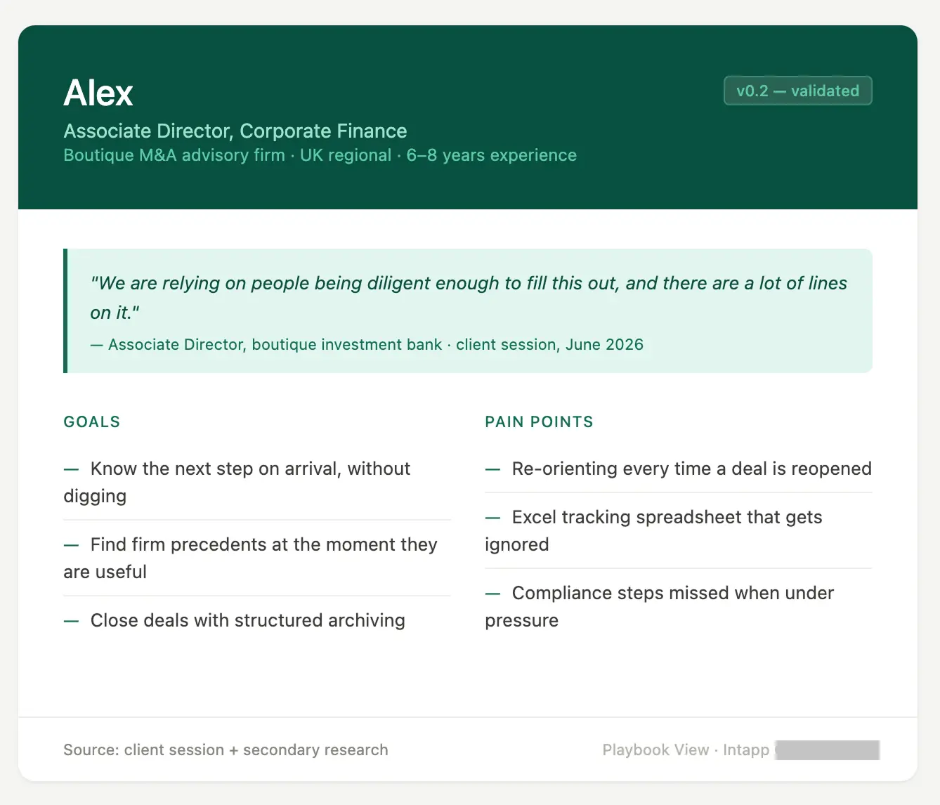
I know this is accurate because a reference client walked me through their process live on screen — including the Excel tracking spreadsheet they used to manage a live deal. It had hundreds of rows. The associate director managing the deal said directly:
"We are relying on people being diligent enough to fill this out, and there are a lot of lines on it."
The product direction I was brought in to design was a different starting point: when you open a deal, the system already knows what stage you are in, what your firm's defined process requires at that stage, and what has and has not been done. It surfaces that proactively. You do not search for it. It is there when you arrive.
My role & constraints
Sole design owner, no PM coverage
I owned the design end to end: running discovery sessions with product leadership and the AI platform designer, facilitating a reference client session with a corporate finance team at a boutique investment bank, defining design principles and the interaction model, producing wireframes across four lifecycle states, building an interactive prototype, and maintaining a living design specification. I presented directly to the Senior Director of Product Management.
No PM was assigned to this workstream at any point. The wider product team had three PMs depart or go on leave in a short period, and this exploratory initiative had no dedicated PM owner as a result. I was producing work without active PM coverage and making daily judgments about what required product-level decisions versus what was mine to resolve through design. I was also navigating an undefined design boundary with a separate designer on the AI product team — I worked transparently alongside her team and pushed for clarity, a conversation still in progress when the project was paused.
Discovery
What I knew and what I did not
What I had
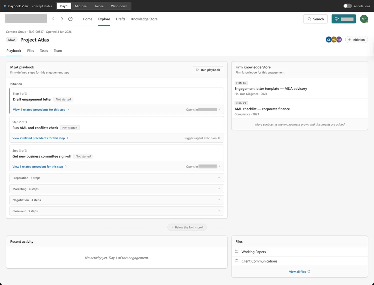
The project was initiated in a briefing from the Senior Director of Product Management. He had a well-formed concept: a stage-aware engagement landing page that replaced the default folder view with a proactive intelligence layer. My job was to test the concept against real user behaviour, identify where design decisions needed to be made, and produce artifacts that could drive the conversation forward. Over two weeks I gathered:
- A reference client session with two people at a boutique M&A advisory firm — an associate director who managed deals and a group operations manager who handled firm-level compliance. The associate director shared his screen and walked through their live deal process, including the Excel tracking spreadsheet used as a process log.
- Two detailed sessions with the Senior Director of Product Management: the initial concept briefing and a follow-up design priorities session that refined scope and confirmed the primary persona.
- A session with the designer on the AI product team, which confirmed the interaction model (no chat prompt in the engagement surface, card-based non-chat model) and established the push versus pull distinction that became the central framing of the project.
- Competitive research across five tools, establishing where each fell short of the three-way combination this product aimed for: engagement type awareness, institutional knowledge access, and firm-defined process.
What I did not have
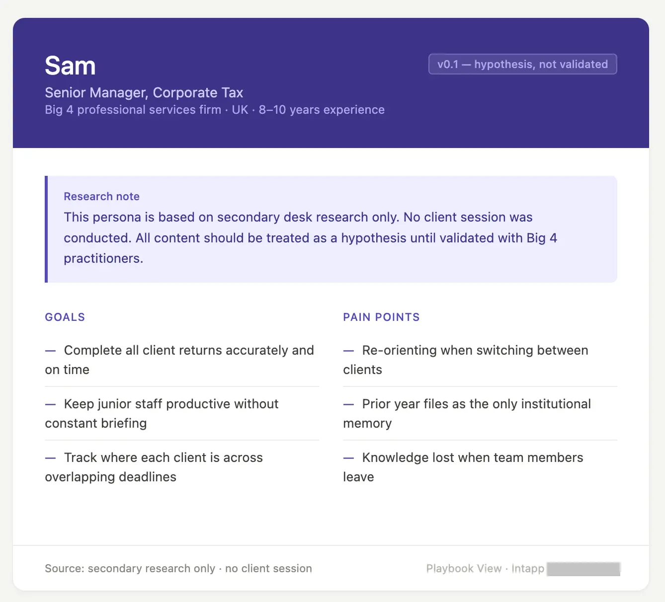
No direct user testing with practitioners. The firm's enterprise clients were not accessible for testing. The reference client session gave me one well-informed perspective from a boutique investment bank, but I was designing for a broader audience including Big 4 professionals and firms of different sizes. I also did not receive the practitioner archetypes I had requested from a Big 4 firm before the project was paused. Every assumption in the design specification is labelled as a hypothesis. Nothing is presented as validated.
The design challenge
Push versus pull — and the data reliability problem
The central design question was not about layout. It was about mental models. There are two ways an AI-assisted product can work. The first is a pull model: the user opens a library, browses for a workflow that fits their task, and launches it. The user is in control. The second is a push model: the system already knows what engagement you are in, what stage it is at, and what your firm has defined as the required process — and surfaces that proactively when you arrive.
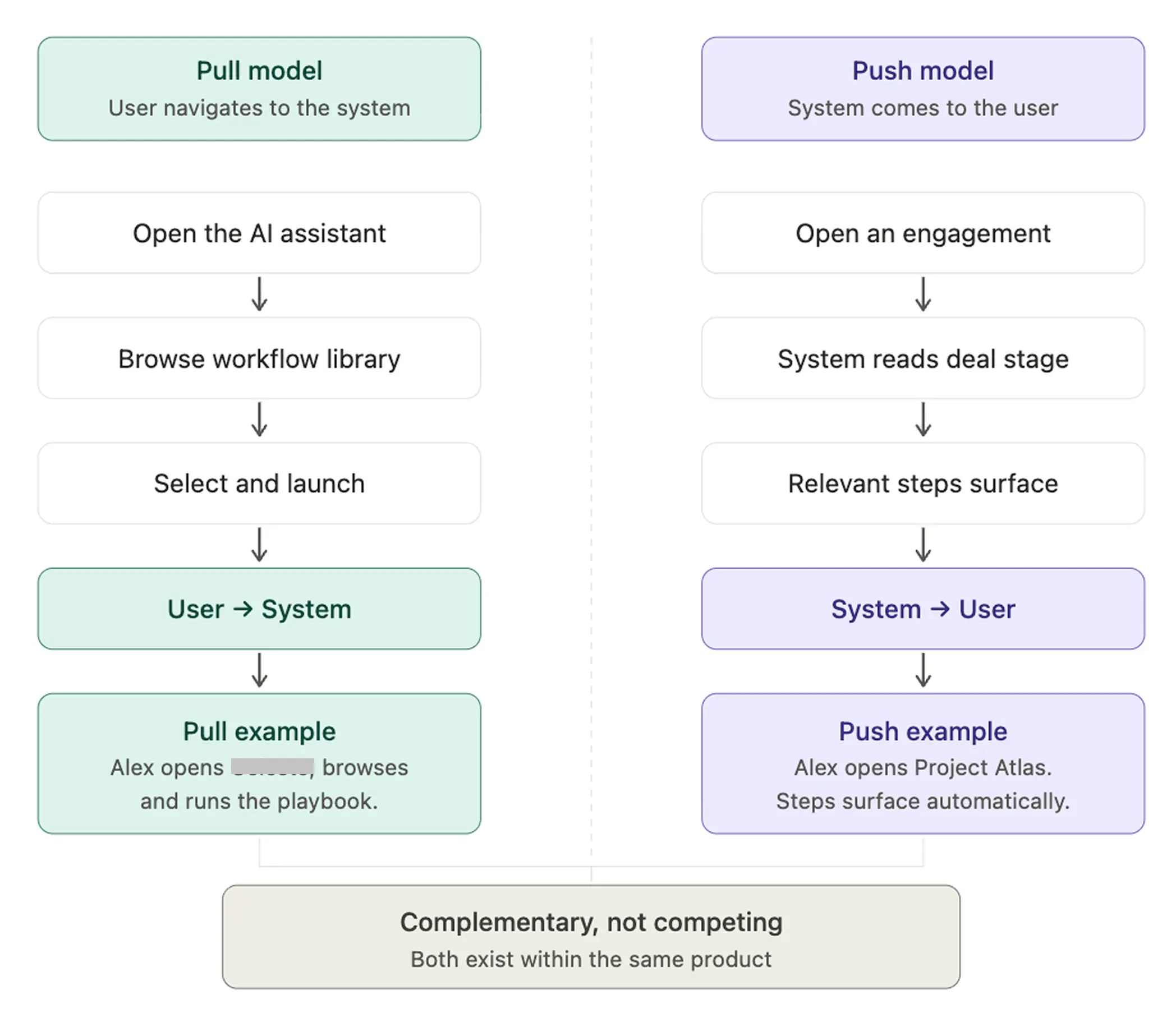
These are not competing products. They are complementary models. But the distinction mattered enormously for the design of the engagement surface. The moment I named it clearly — in a conversation with the AI platform designer — the scope questions became answerable.
The line was: did the system need to act on the user, or did the user need to act on the system?
The second design challenge was the data reliability problem. The push model depends on the system knowing the engagement stage. If that comes from a connected CRM or deal tracking system, it is only as reliable as how consistently that system is updated. During the reference client session, the associate director was candid that their deal tracking system was not always current. If the system cannot reliably know the stage, playbook steps become signals rather than authoritative guides. The design had to be honest about this without making the surface feel unreliable.
Process
From framing to interactive prototype
Phase 1: discovery and framing
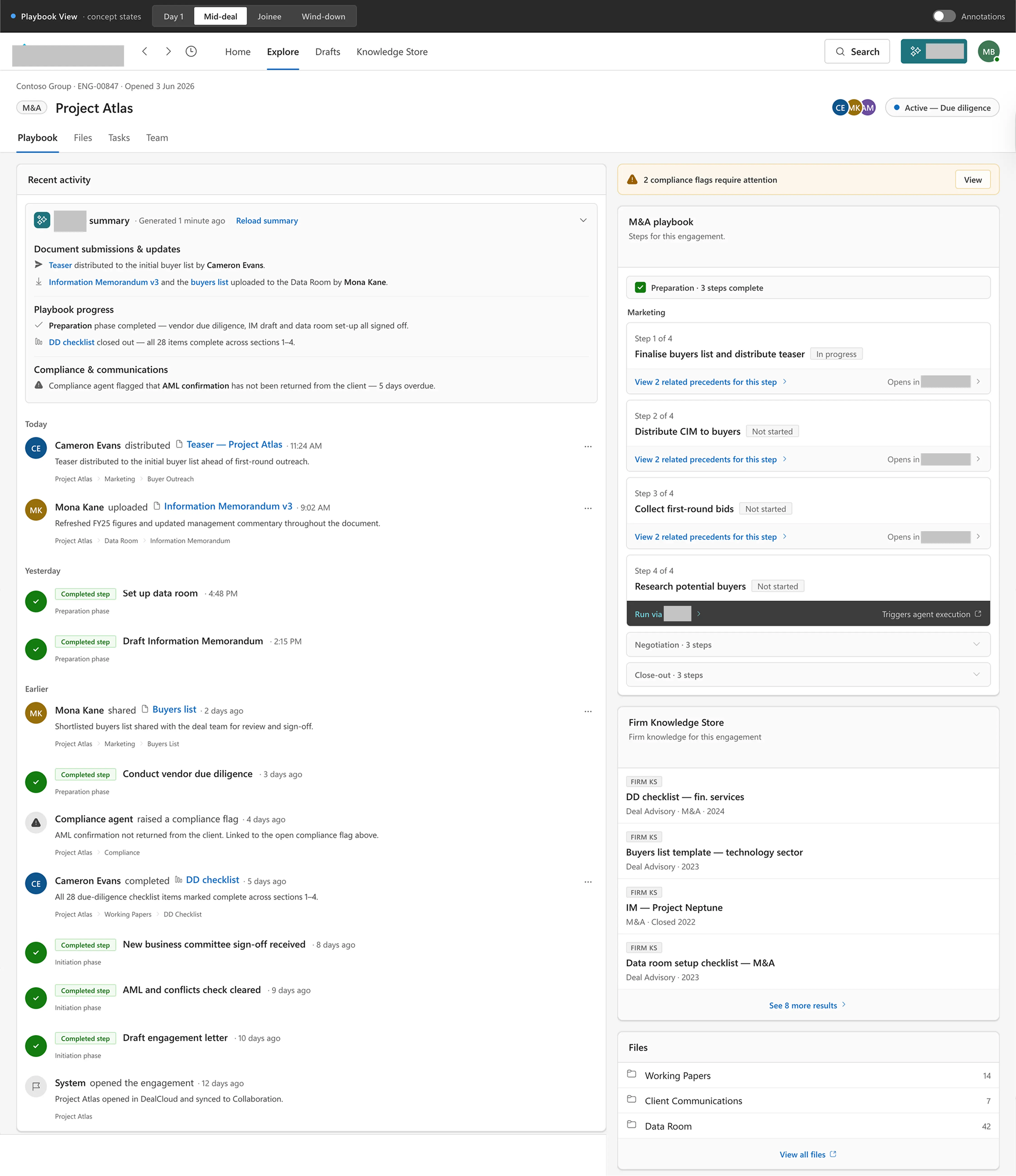
Three sessions in three days: the initial concept briefing, the design priorities follow-up, and the reference client session. Each one changed what I thought I knew. The design priorities session reframed the playbook panel as a focused guide — two or three well-thought-through steps rather than a long generic list. The reference client session confirmed the problem was real: the Excel spreadsheet, the re-orientation cost when switching between deals, and the close-out problem of deals ending without disciplined archiving.
Phase 2: wireframe exploration
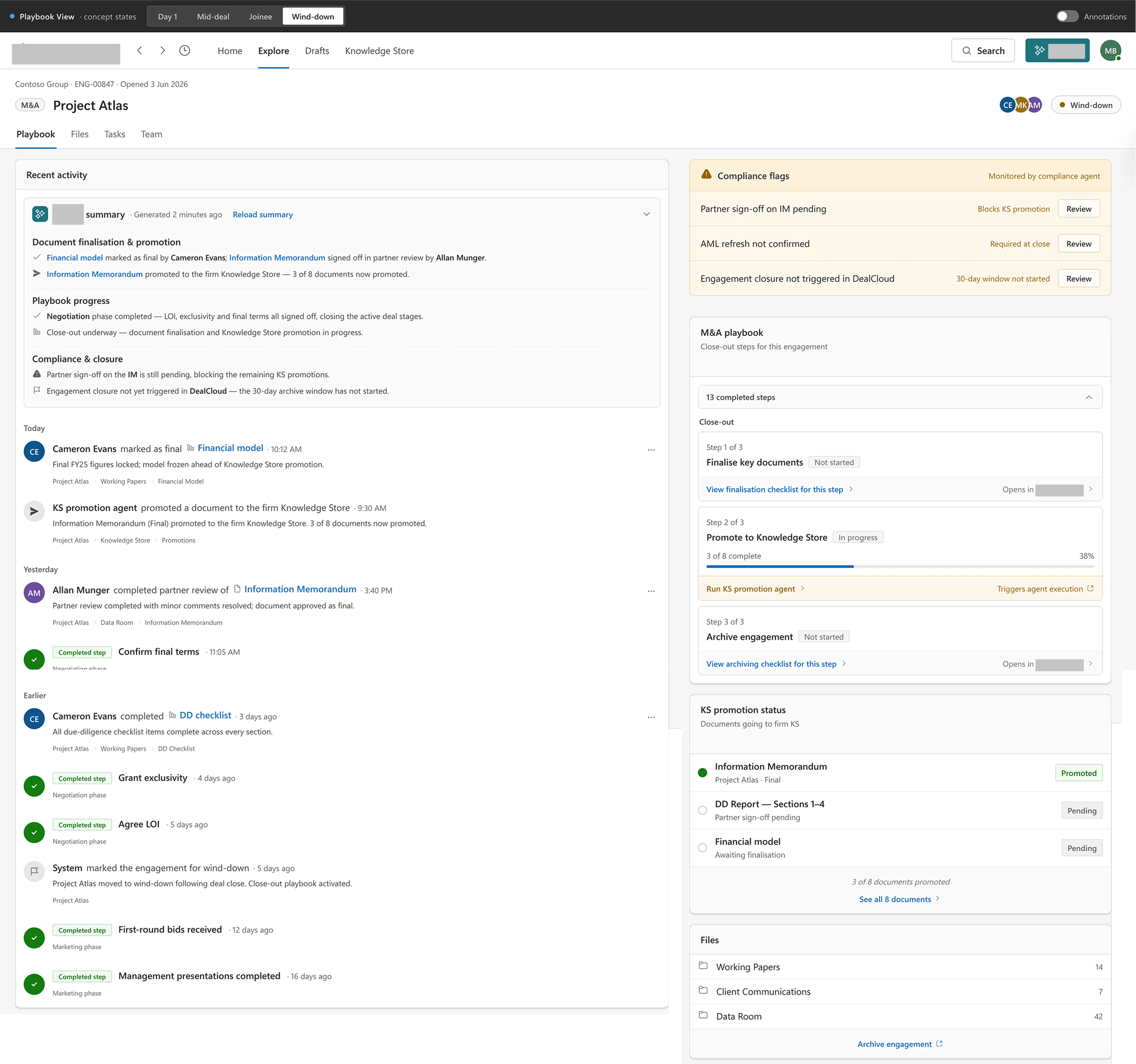
I produced wireframes across four lifecycle states: Day 1 (a deal just opened), mid-deal (active work), a mid-deal joinee variant (first open for someone newly added to a live deal), and wind-down (close-out). Each state was a design problem in itself. Layout went through one significant structural revision: the original design put the playbook panel as the dominant above-the-fold element, but after a stakeholder review I revised it to a 60/40 split with the activity feed as the dominant left column. When you arrive at a deal, the first question is not "what do I do next" — it is "what has happened." The activity feed earns the primary position.
Phase 3: interactive prototype
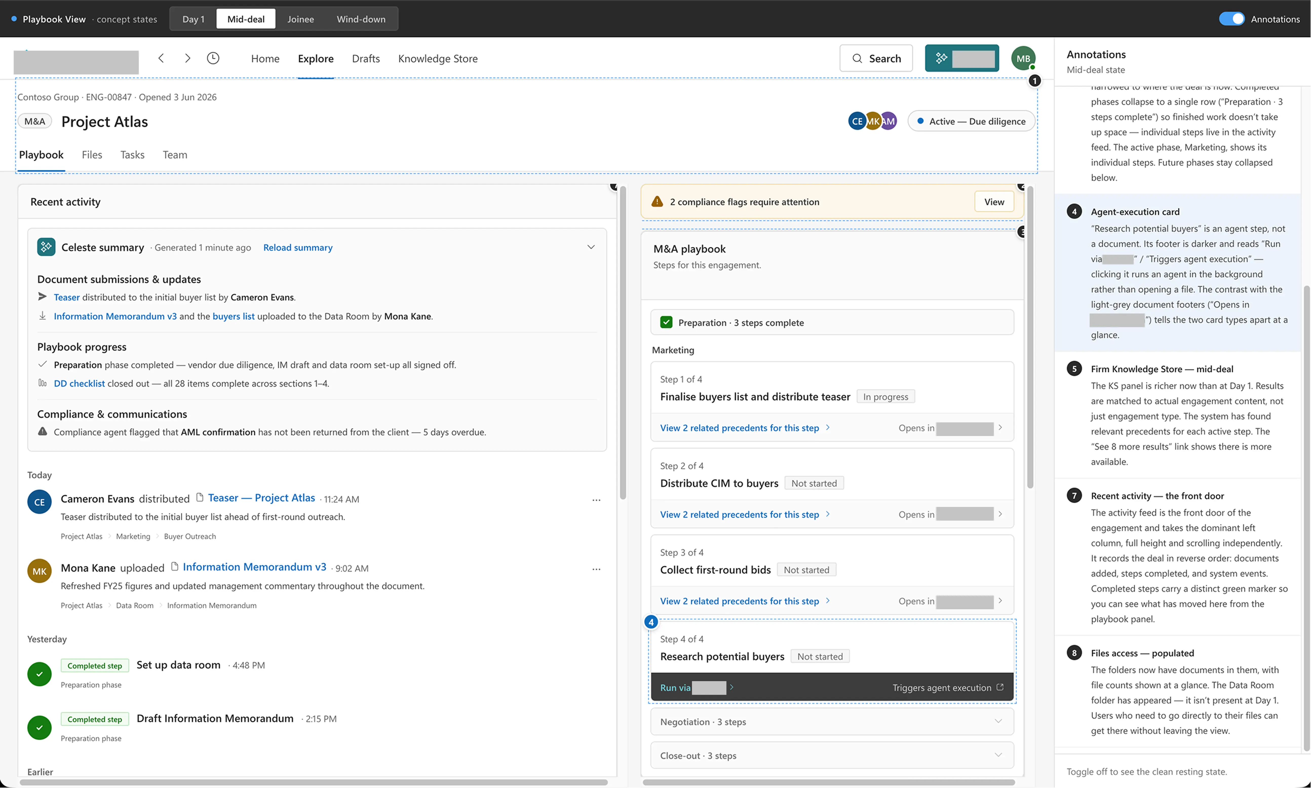
I built an interactive prototype covering all four lifecycle states in a single file, with tab navigation, an annotation toggle, and full content for each state. It used an established enterprise design system and served as both a thinking tool and a presentation artifact — concrete enough to discuss in stakeholder sessions and specific enough that content decisions could be checked against it directly.
Key design decisions
Decisions that defined the surface's character
Activity feed as the front door, not the playbook
The first thing an advisor needs when they open a deal is situational awareness. The playbook tells them what to do; the activity feed tells them where they are. Putting the activity feed in the dominant 60% position reflects how advisors actually orient on arrival. The playbook is available, prominent, and persistent — but it does not demand to be read before anything else.
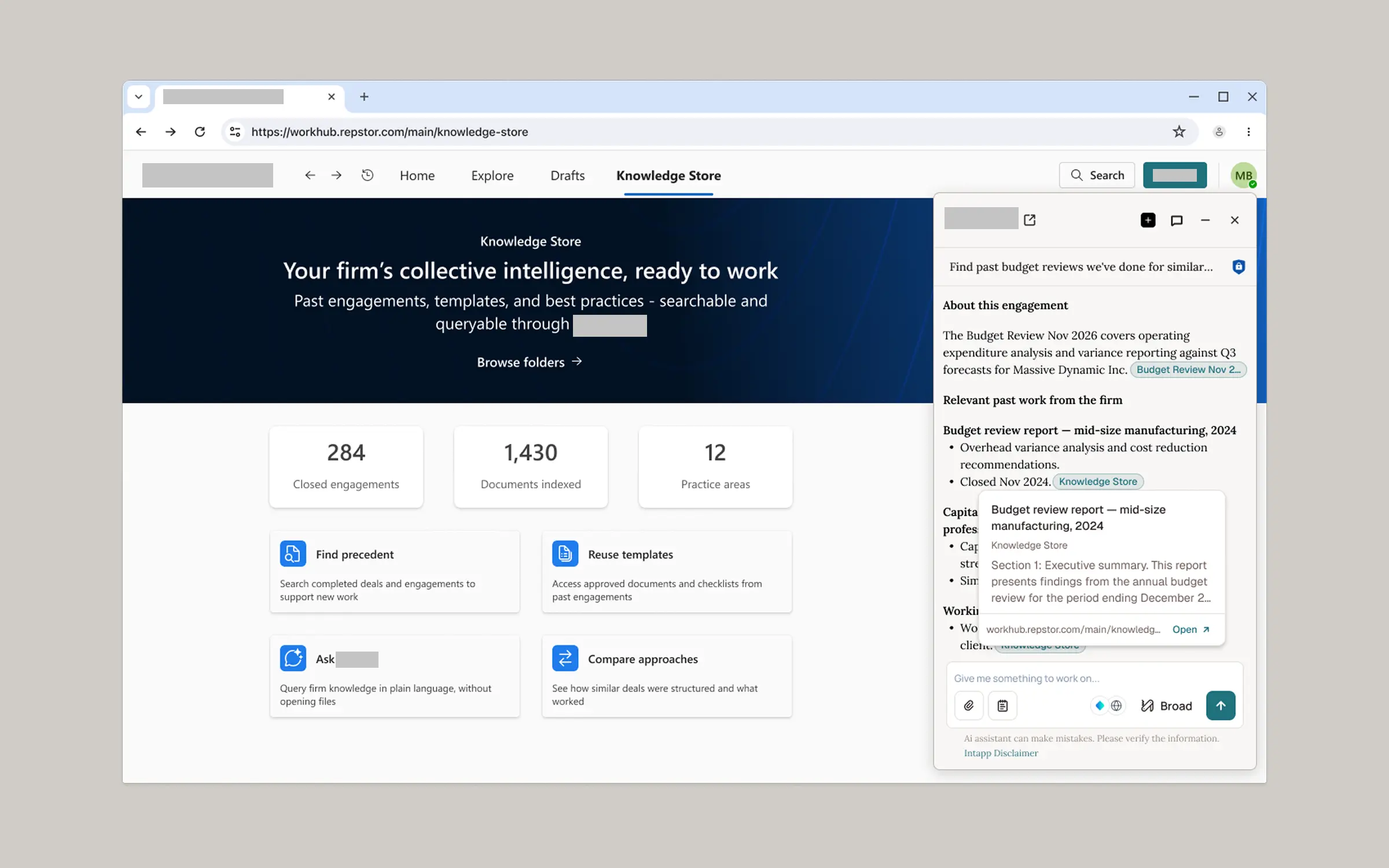
No chat prompt in the engagement surface
Other AI products in this space default to a blank prompt: "Ask me anything." That is appropriate for general-purpose AI tools, not for a proactive engagement layer. I removed the chat prompt entirely and replaced it with cards. The user acts through cards, not prompts — reflecting the distinction between the push model (this surface) and the pull model (the AI platform's chat interface).
Compliance flags as a compact strip, not a feature block
Governance flags could have been designed as a dominant element. I tested that direction and rejected it — a full-width flags block creates anxiety without context. A compact strip at the top of the right column presents the information proportionally: visible, actionable, but not defining the character of the surface.
"AI-assisted" label removed from the playbook panel
An early version labelled the playbook panel as "AI-assisted." I removed that label. The playbook steps are firm-defined and admin-configured — not AI suggestions. Users need to read the playbook and think "this is my firm's process," not "this is what the AI thinks I should do."
Completed steps drop off the playbook panel
Completed steps disappear from the playbook and appear instead in the activity feed, keeping the playbook focused on what still needs to be done. This is a design hypothesis, not a confirmed decision: it raises two open heuristic concerns — no visible confirmation in the panel that completion registered, and unclear recovery from an accidental completion — that require user testing to resolve.
Artifacts produced
What was delivered
- Meeting synthesis notes: concept briefing and design priorities session.
- Reference client session notes (anonymised).
- Persona cards: M&A Advisory Professional (v0.2) and Corporate Tax Practitioner, Big 4 (v0.1).
- Wireframes across four lifecycle states (HTML, multiple versions).
- Interactive prototype: all four states, tab navigation, annotation mode.
- SVG wireframe: mid-deal restructured 60/40 layout.
- Living design specification: confirmed decisions, open decisions, design principles, corrections log, stakeholder register.
- Competitive landscape summary: five tools across four categories.
Outcomes
A well-defined hypothesis, preserved
The project was paused after two weeks of active work. The decision was not about the quality of the work. The Senior Director of Product Management indicated that the wider organisation needed to reach its own conclusions about what users needed before a single team's exploratory direction could be prioritised for investment. The product team's thinking was ahead of where the broader organisation currently was.
All design work is preserved. No decisions have been reversed. The work is paused, not discarded. What the two weeks produced was a well-defined hypothesis: a concrete, detailed, testable design for what a proactive engagement surface could look like, grounded in a real client's process, validated at the interaction model level by the AI platform team, and documented well enough for any designer or PM to pick up and continue.
What I would do differently
Where I would push harder next time
Get direct practitioner access before wireframing. I had one reference client session before producing four states of wireframes. It was valuable, but it was one person at one firm. I would have pushed for two or three more conversations with practitioners at different firm sizes before committing to a layout.
Name the design ownership boundary earlier. I worked alongside the AI platform's designer with an undefined scope boundary for most of the project. I should have requested a formal agreed scope from both design leads in the first week.
Validate the stage data dependency upfront. The push model depends on the system knowing the deal stage. I identified the data reliability risk but did not pursue the technical dependency early enough. A conversation with engineering in the first week would have clarified whether reliable stage data was a realistic dependency or a blocker needing a design workaround from the start.
Reflection
Designing a surface that has a point of view
A filing system has no opinions. It stores documents. It does not know what stage you are at or what needs to happen next. Designing a surface that does know those things — that has a point of view about your work — requires a different kind of design thinking. Every element had to earn its presence. Every label had to be precise. The playbook panel carries firm authority only if it is not accidentally undermined by language suggesting it is an AI opinion.
The project was paused at two weeks. That is a frustrating place to stop. But the work is better for having been done carefully, documented honestly, and held to the standard that every open decision should be named rather than papered over. The design specification that closes this phase is, in my view, the most important artifact: not the prototype, not the wireframes, but the document that says clearly what we know, what we do not know, and what needs to happen before this becomes a product. I will update this case study when the project resumes.