The problem
Comparing versions without leaving SharePoint
A client using the company's document management add-in within SharePoint needed a way to compare document versions without leaving their working environment. The comparison feature already existed in the main product's add-in, but that context didn't match how this client operated — they worked primarily in SharePoint, and the existing solution wasn't built for that environment.
Their specific requirements were straightforward: select two documents, select the versions of each to compare, and switch the comparison order when needed. The gap wasn't in the underlying capability — it was in how that capability was surfaced in the right place.
My role & constraints
Sole designer, three weeks, in parallel with development
I was the sole designer on the development team. The design team provided feedback and review during the iteration phases, but I owned the design work end to end.
The timeline was three weeks. The work ran in parallel with development, which meant iteration rounds were tight and feedback from each round needed to translate into decisions quickly. I worked directly with Product Managers, developers, and the client throughout — all three were involved in reviewing and responding to each version.
Discovery
Establishing the environment and the default use case
The project started with problem definition between the Product Managers and the client. PMs gathered and relayed the client's requirements; I joined discussions to understand the context and constraints.
Two things were established in this phase that shaped the design from the start. First, the client's working environment was SharePoint — any solution that felt foreign to that context would create friction. Second, the most common use case wasn't arbitrary document comparison: it was comparing two versions of the same document. That use case needed to be the default state, not something the user had to navigate to.
To make the required flow explicit before moving to interface design, I produced a user flow chart covering the full document comparison sequence. This gave the team and the client a shared picture of what the feature needed to handle before any screens were presented.
The design challenge
Feeling native to SharePoint inside a constrained task pane
The design challenge was not the comparison feature itself — that logic already existed in the product. The challenge was designing an interface that felt native to the SharePoint environment while fitting within the constraints of a Microsoft Office task pane, which carries strict sizing and behaviour rules defined by Microsoft Fluent UI guidelines.
The tension between task pane constraints and the feature's information needs — document selection, version selection, search — meant every design decision involved a tradeoff between what was possible in the pane and what needed to move elsewhere.
Process
Three iteration rounds with client review
Phase 1: Problem definition and flow mapping
Problem definition with PMs and the client. Output: a clear understanding of the use cases, the client's environment requirements, and the comparison flow. A user flow chart was produced to map the full sequence before interface design began.
Phase 2: First iteration
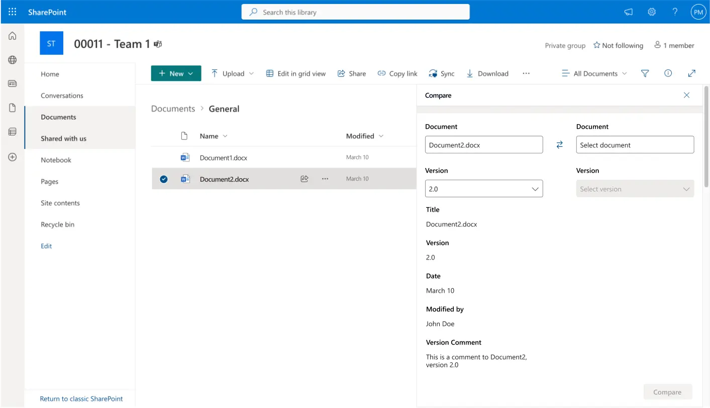
I produced the first version of the solution and presented it to the Product Managers, who arranged a review with the client. The feedback from that round identified five issues: users couldn't select documents from the SharePoint list directly; they couldn't use the rest of the UI while the task pane was open; search needed to happen inside the feature, not delegate to SharePoint; the most common use case — two versions of the same document — wasn't handled as a default; and the experience felt disconnected from the SharePoint environment.
Each piece of feedback pointed to a different layer of the problem — scope, technical behaviour, search architecture, use case prioritisation, and visual coherence. That breadth made the first round more diagnostic than evaluative.
Phase 3: Second iteration
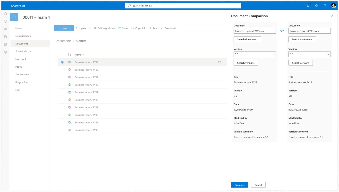
I revised the design to address the first round of feedback. The second version defaulted to two versions of the same document as the starting state, embedded search within the task pane, and aligned the visual language more closely with SharePoint. Feedback from the second round was more focused. The SharePoint alignment was confirmed as working. Two gaps remained: the task pane didn't include the more advanced search options available in the original Outlook modal, and the list needed more space to support easy selection.
Phase 4: Third iteration
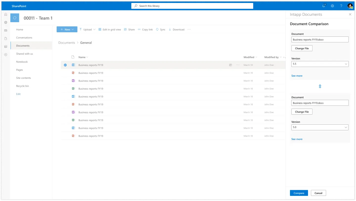
The third version resolved the search options gap by moving search into a modal. This turned out to be technically more viable than accommodating the advanced search options within the constrained task pane — the Fluent UI guidelines set the task pane dimensions, and those couldn't be adjusted. Moving search to a modal gave the feature the space it needed without violating platform constraints. The third version was presented to Product Managers and developers and taken into development for technical feasibility review. Designs were handed off at this point.
Key design decisions
The decisions that shaped the feature
Defaulting to two-version comparison of the same document
This came directly from the problem definition phase, not from iteration feedback. Once it was established that comparing two versions of the same document was the most common use case, making that the default starting state was the obvious call. The alternative — requiring users to navigate to that configuration every time — would have added friction to the primary workflow for no benefit.
Moving search to a modal
The second version embedded search in the task pane. The third moved it to a modal. This wasn't a pure UX decision — it was driven by technical feasibility and Fluent UI constraints. The task pane dimensions are set by Microsoft's guidelines, which meant the advanced search options from the existing Outlook modal couldn't fit. The modal gave search the space it needed and allowed the feature to match the functionality users already had in the other context. Surfacing the technical constraint through iteration rather than upfront analysis cost one round of design work.
Aligning with SharePoint visual language
Positive feedback in the second round confirmed that the visual alignment with SharePoint was working.
"Feels like part of SharePoint rather than detached from it" was the direction the design needed to hold.
For a tool embedded in a client's primary working environment, visual coherence isn't cosmetic. It reduces the perception of context-switching and keeps the feature from feeling like a foreign object dropped into the workspace.
Artifacts produced
What was delivered
- Document comparison user flow chart.
- First iteration: task pane with document and version selection.
- Second iteration: two-version default, embedded search, SharePoint visual alignment.
- Third iteration: task pane with modal search, advanced search options, finalised layouts.
- Design specifications for handoff to development.
Outcomes
Completed and handed off in three weeks
The designs were completed and handed off to development in May 2023. Whether the feature shipped in the form handed off cannot be confirmed — it was a client-specific implementation with further technical review planned after handoff.
The three-week timeline produced three complete iteration rounds with client review at each stage. The use case prioritisation established in discovery — two versions of the same document as the default — held through all three iterations without being challenged.
What I would do differently
Where I would push harder next time
Map technical constraints earlier. Some of the iteration was driven by discovering constraints through the design process: the task pane size limits, the feasibility of modal search, the behaviour of the pane alongside the rest of the UI. A short technical scoping session at the start — establishing what the task pane could and couldn't do before the first version was designed — would have reduced the number of decisions made and then reversed through iteration.
Push for broader user involvement beyond the client. The feature was designed and validated against one client's requirements and reactions. That gave the work real grounding in an actual use case, which is better than designing in the abstract. But the comparison feature was intended to eventually replace the main product's equivalent — meaning it would be used by a wider population than the client it was built for. Even one or two conversations with other users of the existing comparison feature would have surfaced whether the client's requirements were representative.
Establish what structured testing could look like within the timeline. The client review process was more about reactions and initial impressions than observed task completion. That was partly a constraint of the three-week schedule and the client relationship, but it meant the designs were never tested against someone actually trying to use them. A short usability check — even informal, within the team — would have been better than none.
Reflection
A tight process grounded in real requirements
Three weeks and three iteration rounds is a tight process. The pace worked because the feedback loops were short and the client was directly involved, which removed the usual lag between design work and response. That directness also meant the feedback was grounded in real requirements rather than speculative concerns.
The honest gap is validation scope. The design was confirmed by one client, with reactions rather than task-based testing, across three rounds that were partly diagnostic. For a feature intended to eventually serve a broader user base, that's a narrower base than the work deserved. The client involvement gave the project real purpose; broader user involvement would have given it more confidence. The designs were handed off. I cannot confirm the shipped state.